New Racers Logo Personal Project | 2023
From 2021 to 2023 I worked as a swim team coach in my local park district. I had already been working as a lifeguard, swim lesson instructor, and pool manager since 2019, and I had been swimming competitively my entire life. The position just made perfect sense as I was not only already knowledgeable in the subject and working at the pool, but I had swum for the same two teams I ended up coaching for close to 10 years.
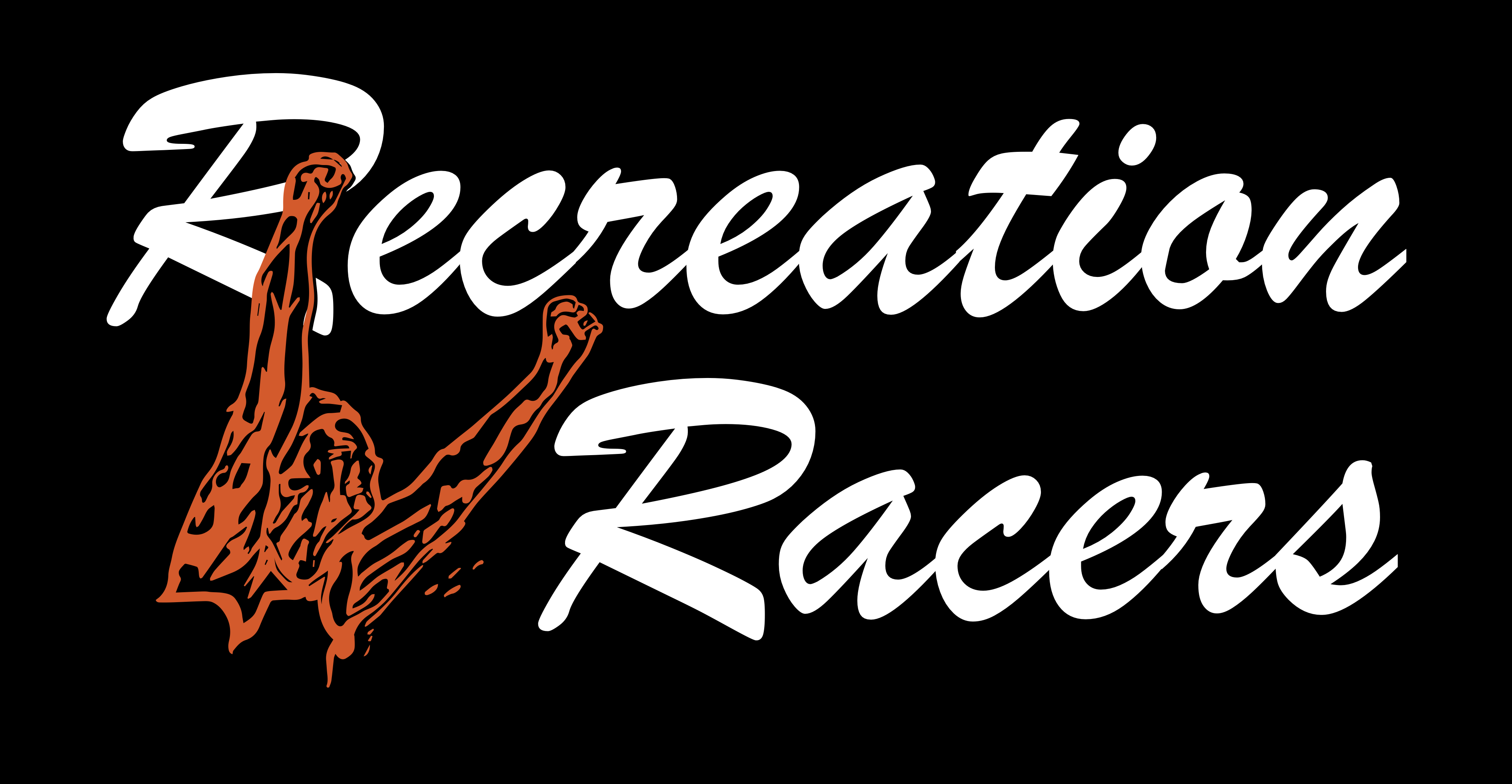
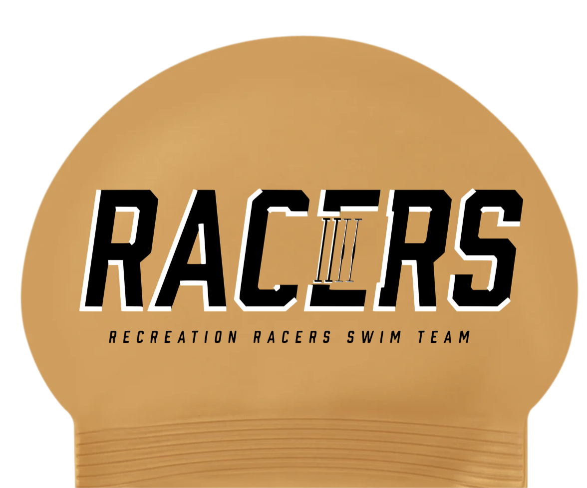
One team I coached was at a more competitive level, but the other team was a novice program that competed against teams from other pools in the same park district. The goal for this team was to get kids interested in swimming and to also promote swimming as a form of exercise. The other coaches and I wanted to help engage the kids even more, and we arrived at the age-old swimming tradition of collecting swim caps with various different designs and team logos. Swimmers love to collect special edition caps from their high school and club teams, and trade them with members of other teams. Our main logo was fine, but we wanted to create something new and special for the kids, so I tried my hand at some design and arrived at the logo pictured at the top.
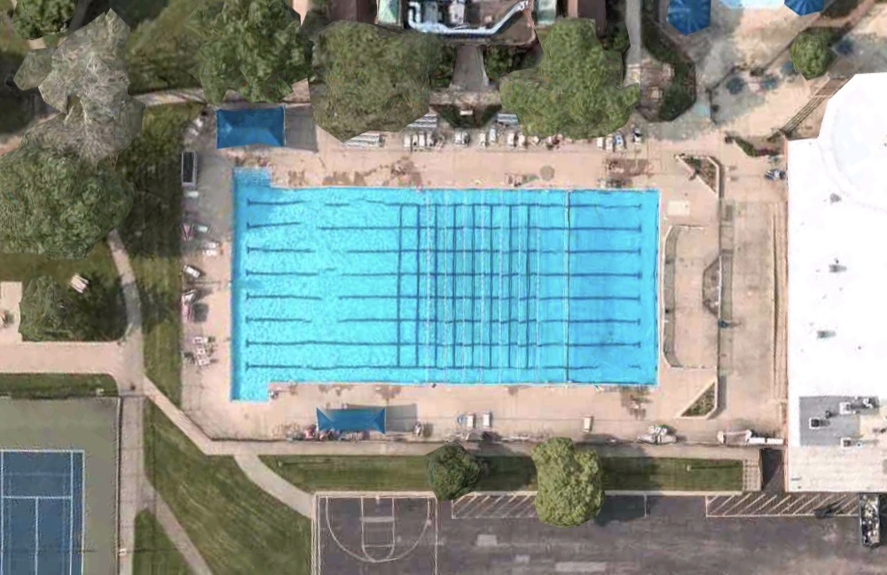
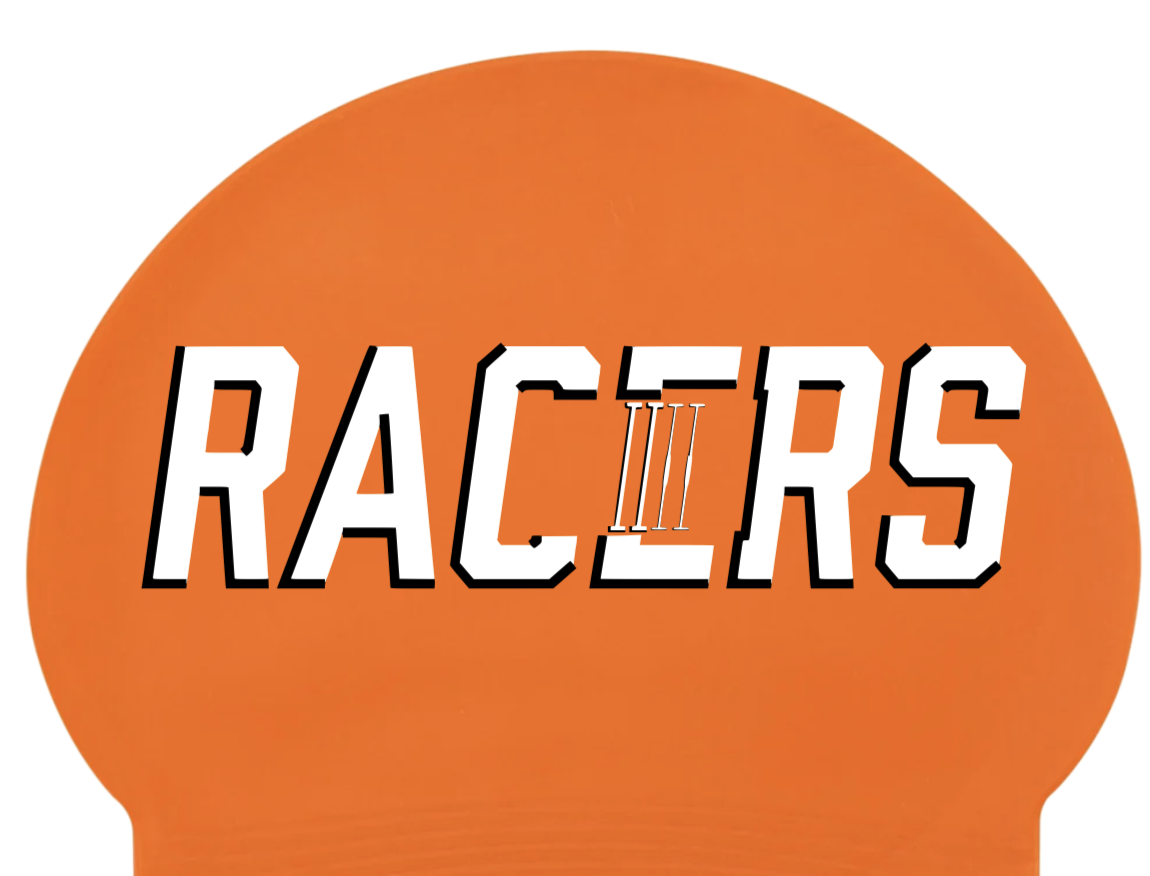
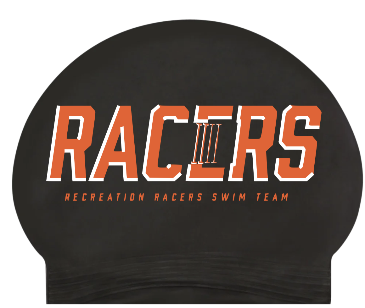
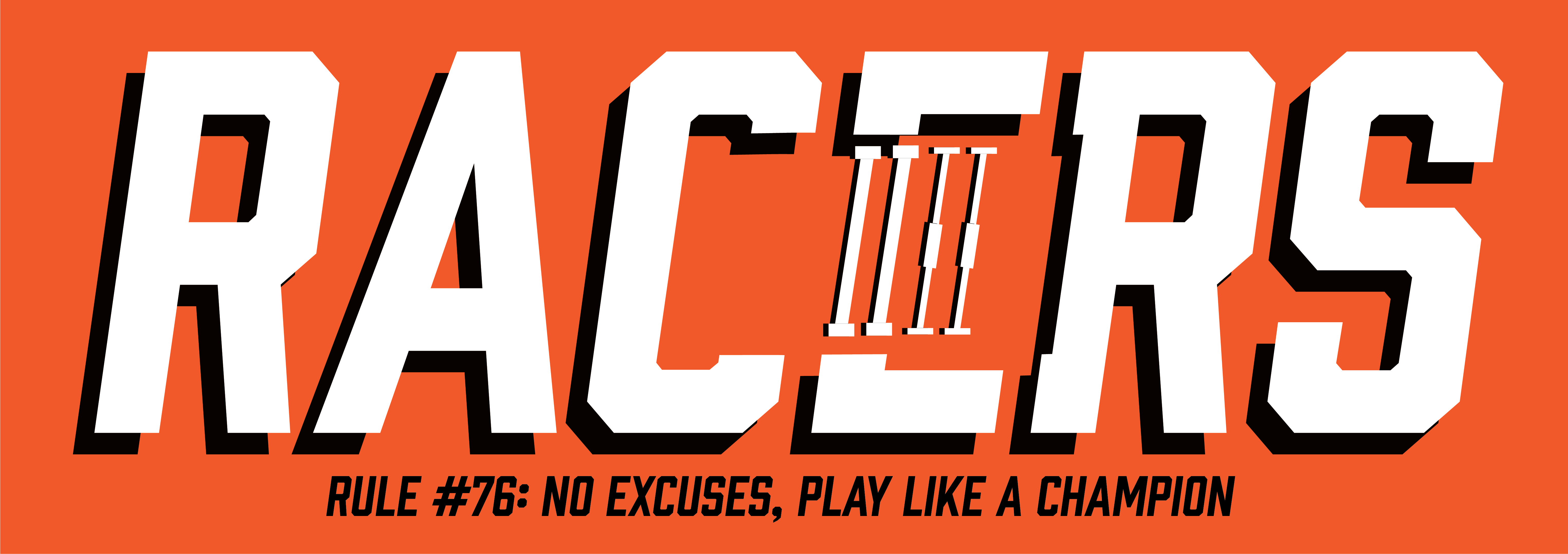
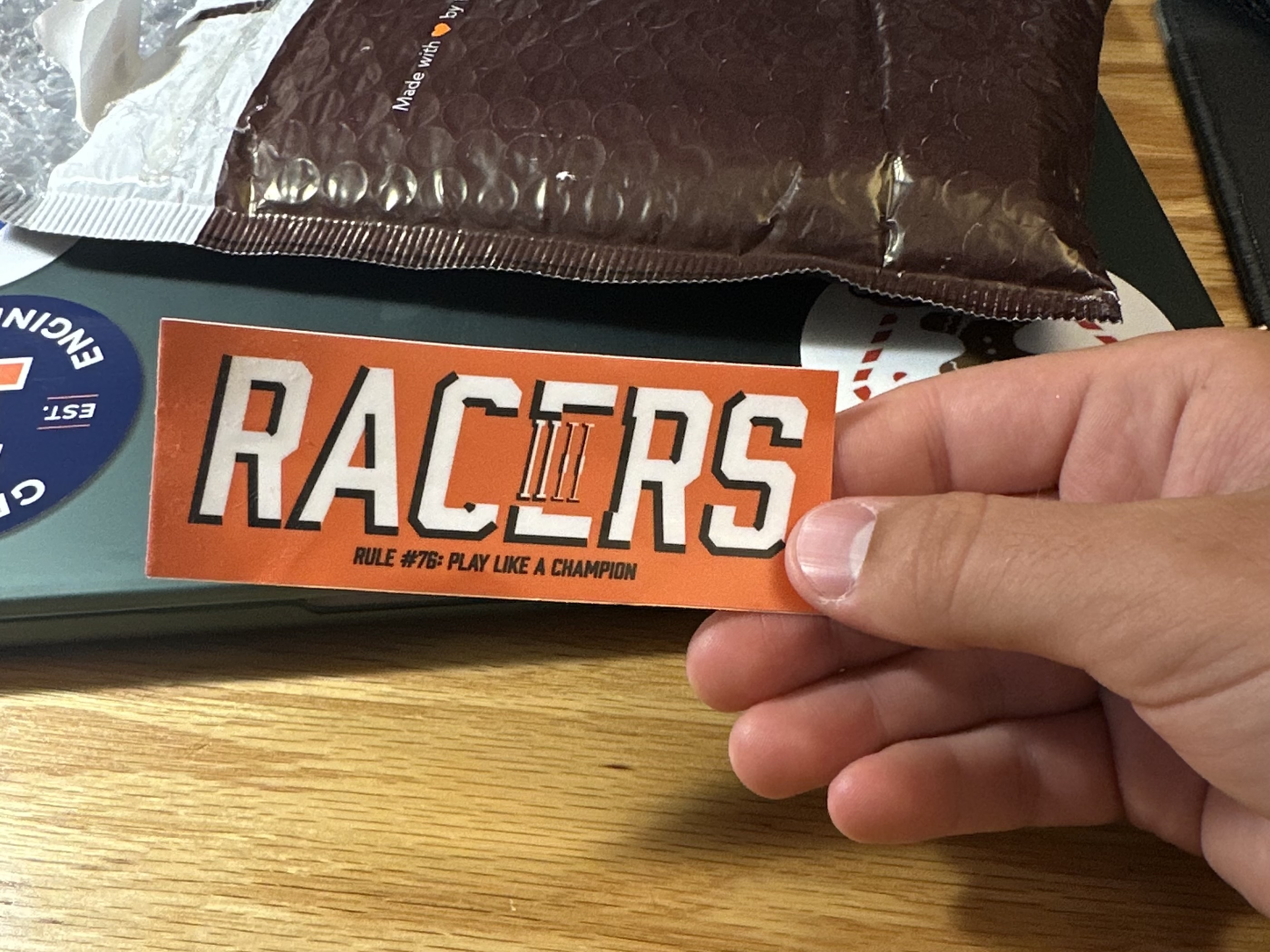
For a little bit of design background, the word mark “RACERS” (the team’s name) contains a hidden outline of our pool within the “C” and “E”. The middle section of the “E” shows the lane lines in the middle of the pool. I thought it was a fun little nod, albeit without the greatest execution. At this point I still barely knew what I was doing in Adobe Illustrator, and I was more or less making it up as I went. You can see the pool outline in the satellite image above, although as of writing this the former 80-year-old pool has been completely torn out and is being replaced (super sad for my childhood nostalgia, but great for the community). As I said, our first thought was to use the new logo for an alternate swim cap, and we tried out several different color schemes that you can see below. Ultimately, we determined having a two-color design on a cap was too expensive, and so we landed on using the design for a sticker and moved to another design for the cap. The kids loved the stickers though, so it was still a success in my book!
Throwbck Swim Caps
Personal Project
|
2023
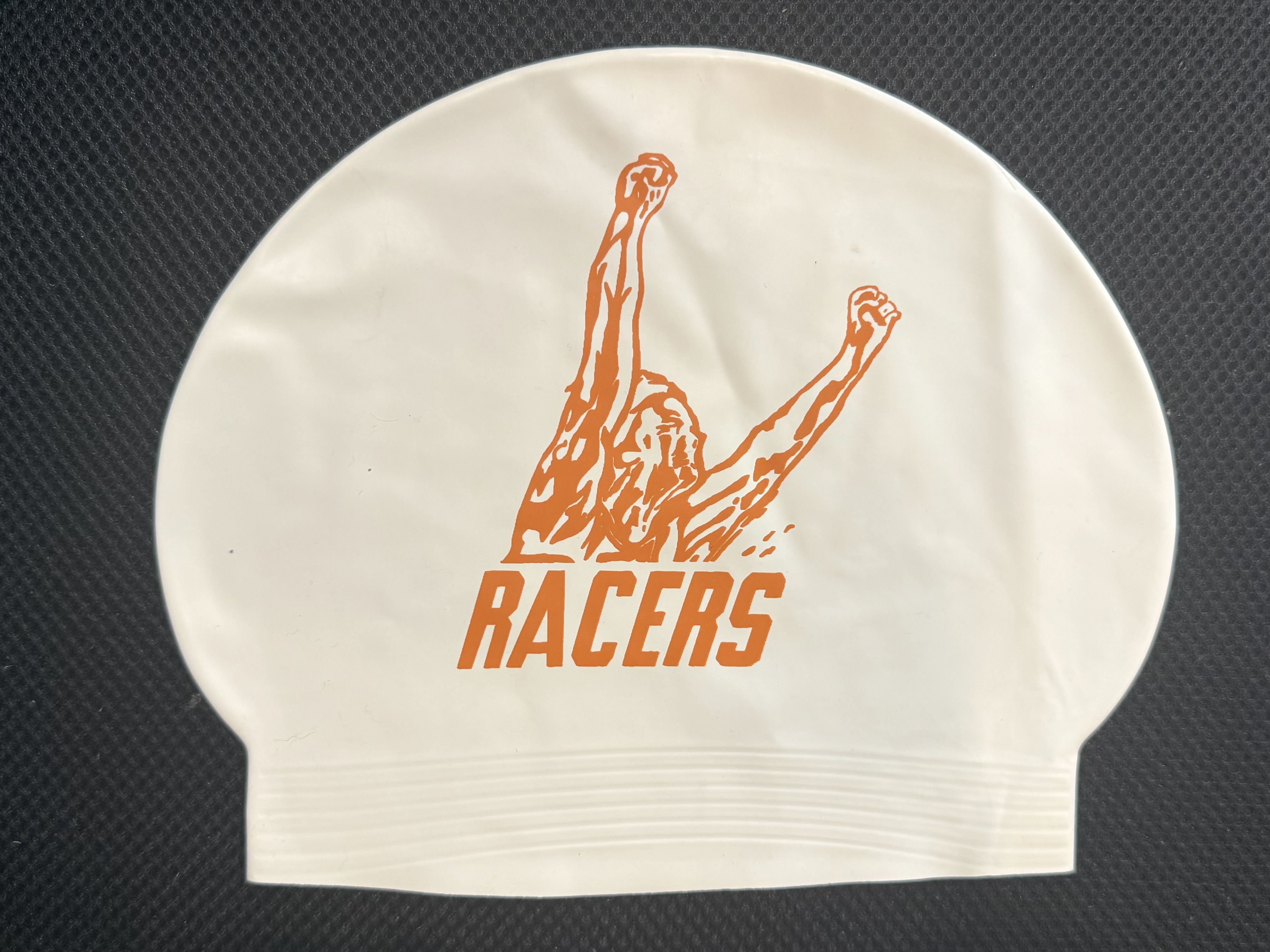
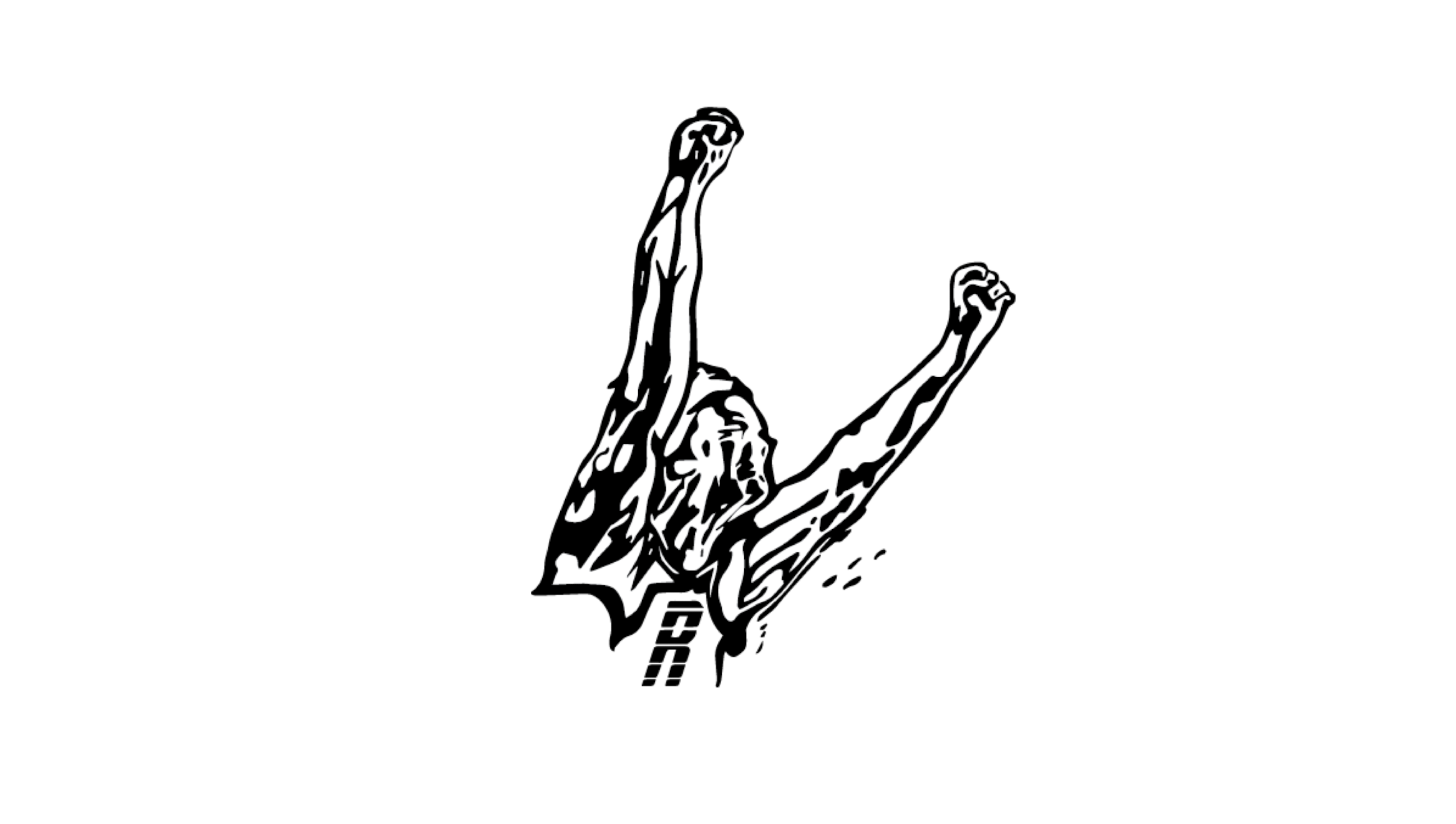
As mentioned before, we realized that a multicolored swim cap design was not going to fit our budget (we were paying for these with our own personal money as coaches) so I shifted to another idea. My mom had swum for the same swim team when she was a kid in the 80s and coached the team in the 90s. Because of this she had given me several of her old t-shirts, most of which included a very cool retro logo with a swimmer throwing their arms in the air after winning a race. I wanted to bring this logo back to use on caps, but no vectorized images existed of it. So, I did my best to recreate the image in Illustrator using my t-shirt as a reference. It turned out great, and we ended up using it on a white alternate cap design that we awarded a limited number of kids each week for outstanding work effort and sportsmanship. By the final meet of the season, the entire team was wearing the new throwback.
Another Sticker Personal Project | 2024
After leaving the park district for an engineering internship, I still stayed in touch with the other swim coaches. In 2024, they reached out and asked me if I could throw together a new sticker design. My answer was “of course!”. For this one, I didn’t go all in and create a brand-new logo, but I threw the aforementioned retro logo together with script text similar to the style that the park district used for branding. While less imaginative, I am pretty happy with how it turned out!